Oriënteer-Navigeer Routes · 2019
logo design · branding
Oriënteer-Navigeer Routes is a young initiative that sets out orienteering routes in beautiful natural areas in the Netherlands, with the goal to encourage people to go out and explore their surroundings in a fun way. The routes consist of many checkpoints between which explorers can plot their own route, deciding themselves how to travel and how fast to go.
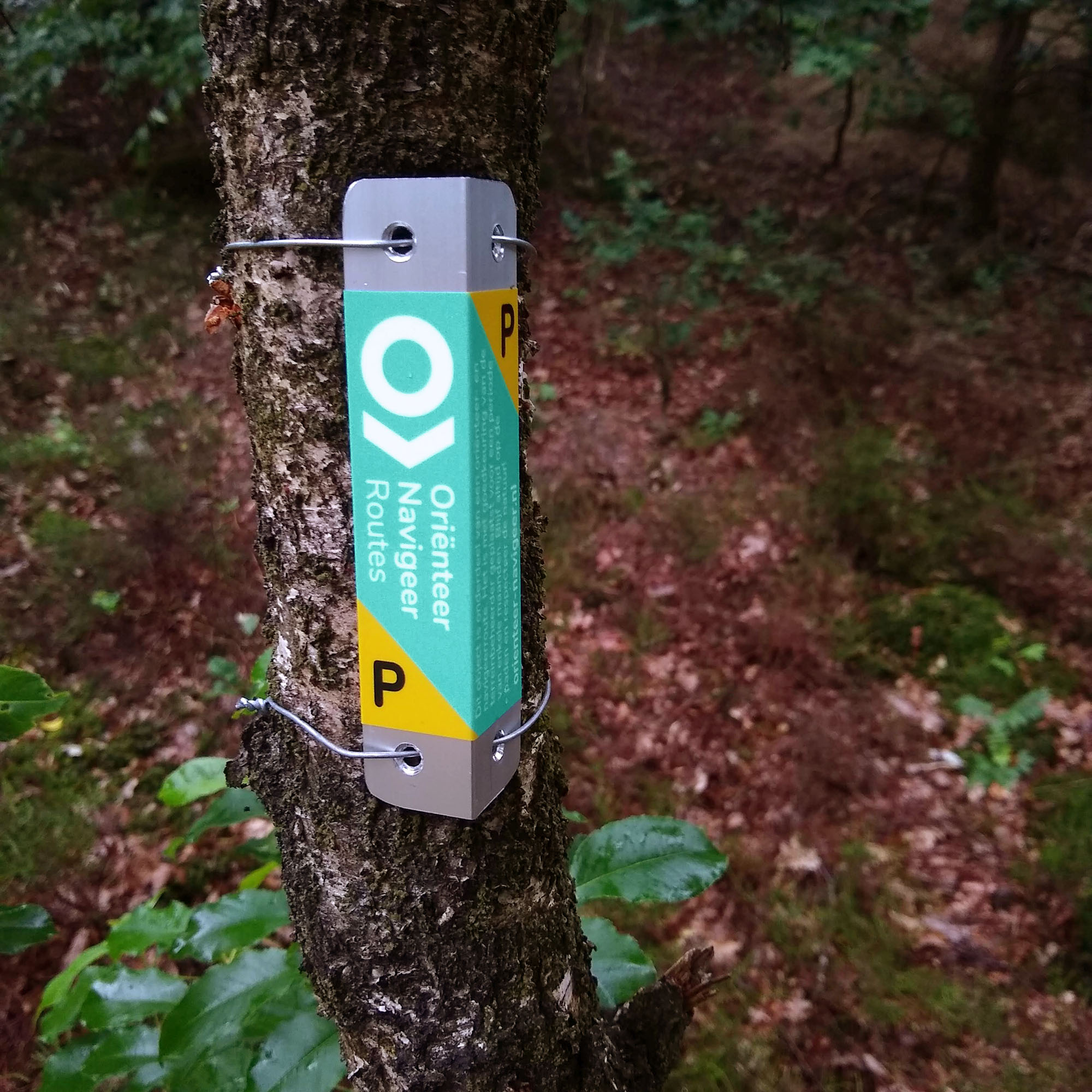
The initiative was in need of an attractive and recognizable visual identity. An important requirement was that the visual identity should make the checkpoint markers visible in their natural surroundings, so that they won’t be too hard to find, but without looking out of place.
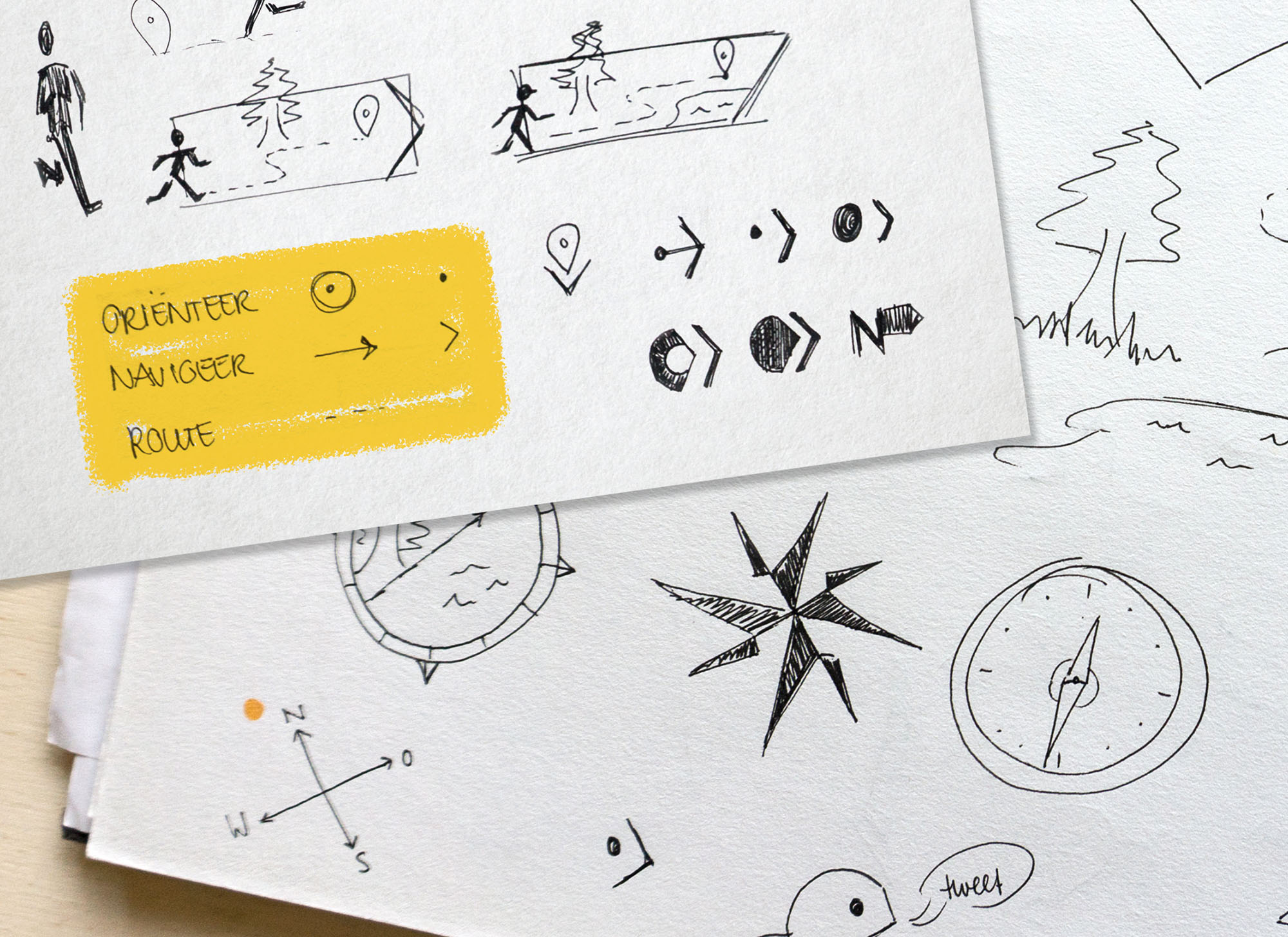
For the logo I looked at various orienteering logos and visual metaphors for orientation and navigation, such as compasses and signage, exploring a range of figurative and more abstract visuals.
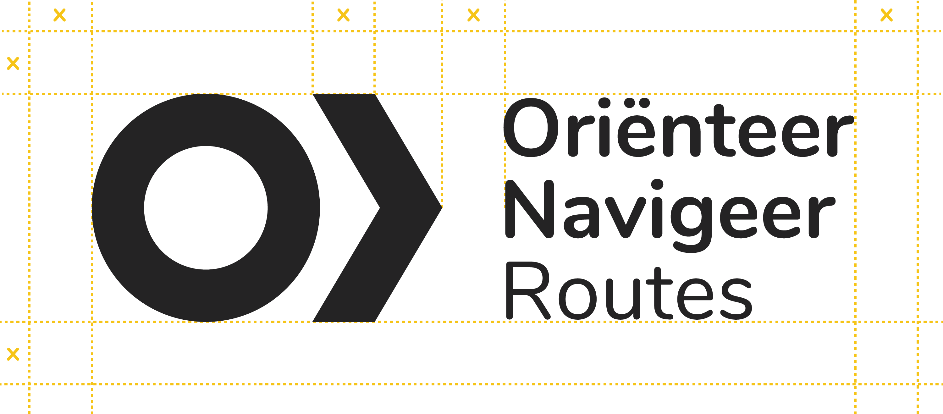
The final circle-and-arrow logo is derived from the name of the initiative itself:
- Oriënteer (to orient) – to know where you are – a dot or circle
- Navigeer (to navigate) – to know where to go – an arrow
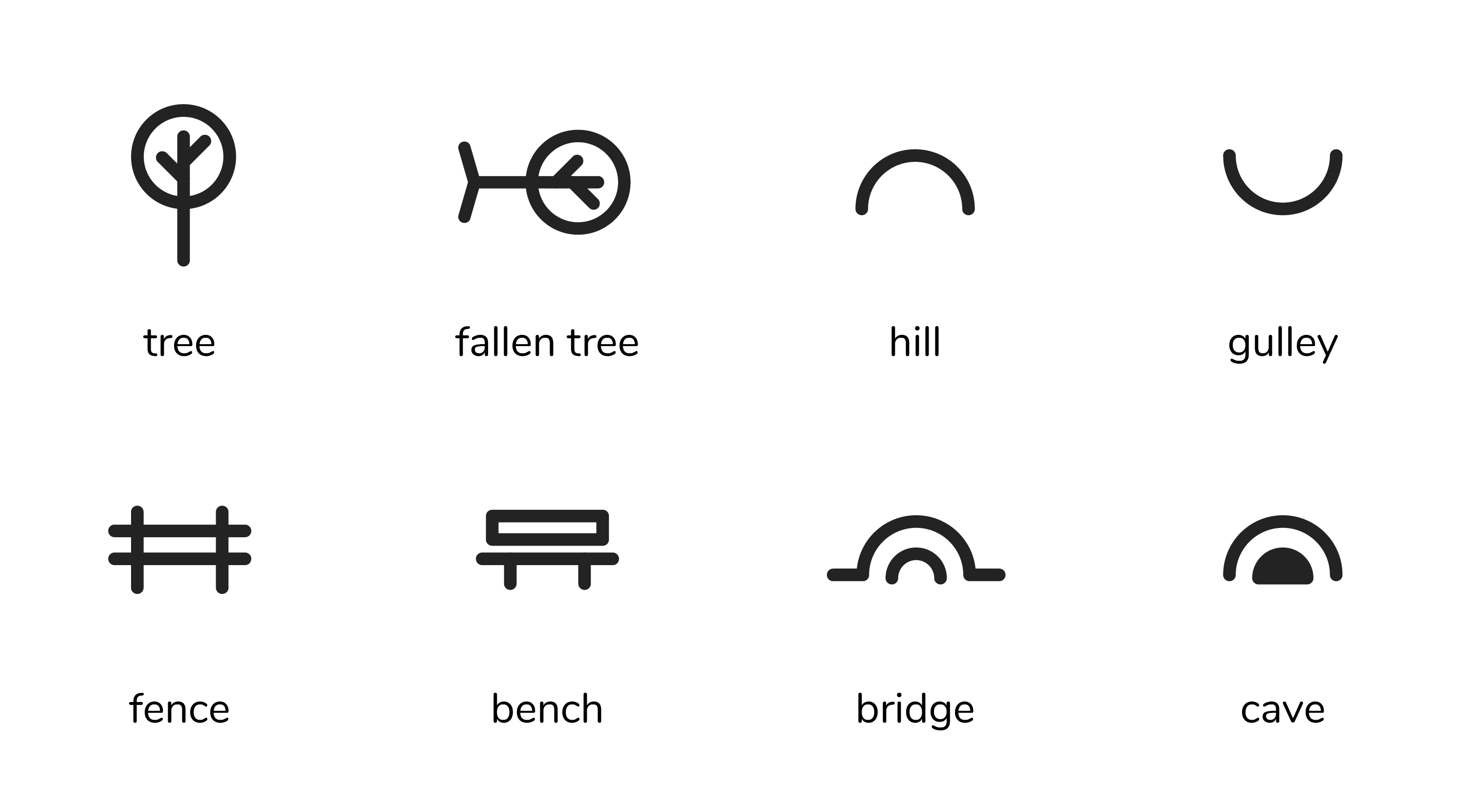
People making use of the checkpoint network will need a map that shows the approximate locations of the checkpoints. The icons below provide hints that will make finding the exact location of the checkpoint easier.
